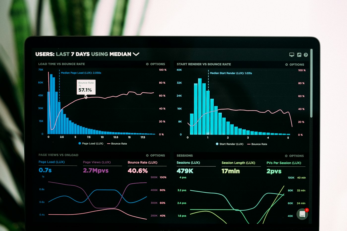
Walk into almost any business and you will find a dashboard somewhere that nobody looks at. It was built with the best of intentions, shown off once in a meeting, and then quietly forgotten. The data still flows into it. The charts still refresh every morning. And yet not a single real decision ever runs through it.
A dashboard is not a trophy you build and admire. It is a tool for making a decision faster, and with more confidence than a gut feel would give you.
We build a fair number of these for clients, and the ones that stick have almost nothing to do with how pretty they are. They have everything to do with whether they answer a question someone actually has, at the moment they need it answered.
Why most dashboards quietly die
When a dashboard goes unused, it is rarely a tooling problem. It is usually one of these:
- Too many numbers. Forty tiles, six colours, three fonts, and no idea where to look first. A wall of data is not insight, it is noise with a login screen.
- Built for nobody in particular. If it tries to serve the finance lead, the warehouse manager and the CEO all at once, it serves none of them well.
- Vanity metrics. Numbers that feel good but change nothing. Total page views. Lifetime sales. Big, impressive, useless for today's decision.
- Data you cannot trust. The moment someone spots one wrong figure, they stop trusting the whole screen and go back to their own spreadsheet.
- No comparison. A number on its own means little. Revenue of R840,000 is good or bad only against a target, a budget, or last month.
Start with the decision, not the data
This is the part most people skip. They start with the data they happen to have, then go looking for charts to put it in. We work the other way around. We start with the decision the dashboard is meant to support, and let that decide what goes on the screen.
Three questions we ask before building anything
- What decision should this help someone make? Reorder stock? Chase an overdue account? Move a person between sites? Name it plainly.
- Who makes that decision, and how often? A daily call for a team leader looks nothing like a monthly board review. Same business, very different screen.
- What would change their answer? Whatever that is, it belongs on the dashboard. Everything else is clutter you can leave off.
If a number on the screen does not change what somebody does, it is decoration. Treat it that way and cut it.
What a dashboard that gets used looks like
Strip away the noise and the useful ones tend to share the same handful of traits:
- A few numbers that matter, up top. The three or four figures the reader checks first, large and impossible to miss.
- Built-in comparison. Every key number sits next to a target, a budget, or the previous period, so good and bad are obvious at a glance.
- A path to the detail. Start with the headline, then let people click down into the why when they want it. Not the other way around.
- Data you can stand behind. One agreed source, refreshed on a schedule everyone knows, with the last update time shown on the page.
- Plain labels. Words the reader uses, not the column names from the database.
The five second test
Show the dashboard to the person it was built for. Can they tell you whether things are going well or badly in about five seconds, without you explaining it? If yes, you have something. If they go quiet and start hunting, the design is doing the wrong job.
One version of the truth
A lot of dashboard pain is really a data problem wearing a disguise. When sales, finance and operations each keep their own spreadsheet, every meeting starts with an argument about whose number is right, and no chart can fix that.
The fix is to pull the important data into one place, agree what each figure means, and let everyone draw from the same well. That is the quiet work behind a good reporting setup, and it is exactly what modern BI and reporting tools are built to sit on top of. Get the foundation right and the dashboard almost builds itself. Skip it, and you are just putting a nicer frame around the same confusion.
A dashboard earns its place the day people open it on a Monday morning without being told to. Not because it is clever or colourful, but because it answers the question they were already asking, and they have learned they can trust what it tells them.