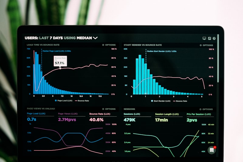
The request that reaches us is almost always for reporting. What we find underneath is almost always definitions. Sales counts an order when it is placed, finance when it is invoiced, and operations when it ships — so three honest people produce three different numbers and every meeting starts by relitigating which one is real.
No visualisation tool fixes that. Building a beautiful dashboard on top of it just produces confident, well-designed disagreement.
What we actually do
Agree the definitions — what counts as a sale, a customer, an active job, a completed order — and write them down where anyone can check them. Fix the data at source, so the numbers are right before they are pretty; that is the argument we make in clean data and it has not lost yet. Build the reporting in Power BI or whatever you already own. And decide what not to measure, which is the part clients remember.
The test every measure has to pass
Before anything goes on a dashboard we ask: who looks at this, and what do they do differently when it moves? A number that fails that question is decoration. It costs attention every week, it makes the useful numbers harder to find, and it will still be there in two years because nobody wants to be the one who removed it.
Most reporting projects would be improved by deleting half of what they contain. We would rather deliver six measures a leadership team acts on than sixty they scroll past, and we go into the reasoning in the KPIs that actually matter.
A beautiful dashboard on bad data does not create insight. It creates confident, well-designed error.
Where the data comes from
Usually from more places than anyone expects: the ERP, the accounting package, a spreadsheet the operations manager maintains, and a system whose supplier went quiet in 2021. Part of this work is getting those to a single, refreshed, checkable source — which overlaps heavily with systems integration, and the two are often the same project seen from different ends.
Where data is being captured by hand at the end of a process, we usually push it back to the source instead. A figure typed from memory on Friday is not data, whatever it looks like on a chart.
What a first engagement looks like
A short discovery on the decisions you are actually trying to make. A written set of definitions you sign off. One reconciled data source. Then a small dashboard covering the handful of measures that survived the test — in use within weeks, not a six-month programme that lands after the question has changed.
What you get
Reporting people open without being chased, because it answers something they need. Definitions written down, so a new finance manager inherits the reasoning rather than the argument. A refresh that happens on its own. And a model documented well enough that you are not dependent on us to change a measure.